
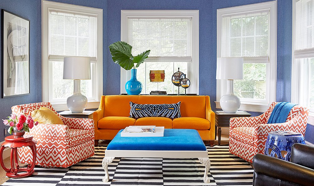
You might have noticed the abundance of the orange/blue color combo in movie posters recently, and it’s no accident. While orange blue represents Hollywood action movies very nicely, it can also turn your home into a soothing and cheerful place to be. That’s not to suggest that you paint your walls bright orange and paint all of your furniture blues (though please send us a picture if you do!), but the simple math says that if the Hollywood marketing juggernaut is using it, there’s a safe bet that there’s something to it.
Bright oranges, especially, are not something many people consider when decorating their homes. Hollywood follows the “more is always better” approach when it comes to aesthetics, but you can dial it down a good deal and end up with a fantastic-looking living room, bedroom, kitchen, bathroom, or nursery.
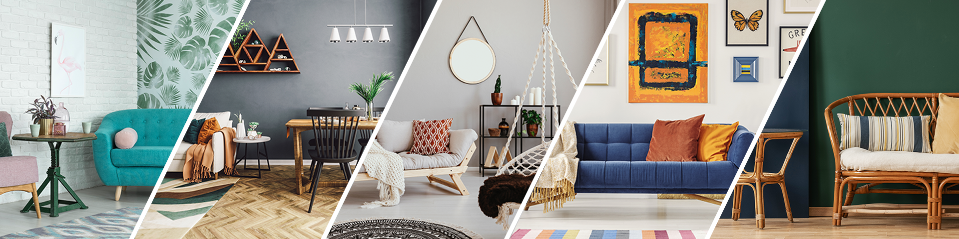
How do you bathe yourself in soothing blues and cheerful oranges without overdoing it? Simple: accents and wall art. Most decorators choose one main color for the room, a color which the walls, bedsheets, and accessories will closely adhere to. We suggest that you use blue for this color, as it’s easy to become overpowered with orange. Put this together with some simple orange accents, such as festive framed prints (or even solid color wall hangings), books with orange covers, or curtains with simple orange patterns and you’ll achieve this color combination without overdoing it.
A soft orange can also work for a room’s primary color, especially when balanced out with a deeper blue. This can give a room that warm, hazy look that recalls decades past but still looks modern and classy. Walls, sheets, and curtains are fairly easy to choose, and picking them out can be a mundane task, so we recommend putting the real effort into choosing the prints that will adorn them.
For a blue-centric room, look into prints of sunsets, prints of great autumn weather, fall landscapes, bright abstract paintings, and earth-toned prints of outdoor life. For orange-centric rooms, look into nautical prints (ships at sea, ocean life, beaches, etc.), outdoor photos focusing on blue skies and cool colors, and matching floral prints. The sky is the limit with what you choose, and it’s an absolute blast comparing photos, paintings, and prints with your blue or orange-centric rooms to see what works best and fits your sense of style.
In the end, it’s very easy to feel overpowered by an orange and blue room, but it’s worth putting the extra effort into choosing colors and home décor framed art. If good results are achieved, you’ll be swimming in a room that’s both calming and cheerful, thanks to tasteful color combinations and framed artwork for the bedroom, kitchen, bathroom, nursery, and beyond.